Sawtooth Saltbox
The following is a guest post and house design from one of my regular readers, Craig Moorhouse. As you can see the design isn’t exactly tiny but contains so many great ideas and detail I asked Craig if for permission to share it with you. Thanks again Craig!
I sent a handful of Google SketchUp drawings of a modular container home concept that I’ve had for a few months now to Michael at his Tiny Home Design website. The home has a floor plan of just under 1000 sq. ft and isn’t tiny (or small for that matter) but Michael found worth in these drawings because of the work I put into the home’s detail and because it showcases the possibilities of what can be done with this 3 dimensional drawing tool.
The concept behind the house – in a large nut shell – is this.
- I wanted to create a shipping container home that didn’t hide the “steel box” – to make the shipping containers a visual part of the design concept.
- To make the home well insulated – making use of passive solar heat retention – incorporating a roof that could shed snow loads and winter’s winds.
- Draw up a floor plan that would present myself with something I could live in – something that could fit the different elements of my life into a completely realized home – if I make a floor plan for myself – many other floor plans could be drawn up to suit other’s lives.
- To present the concept as an artist whole, that adhered to the Bauhaus concept of allowing the function of the design to dictate it’s form.
I call this concept a “Sawtooth Saltbox”
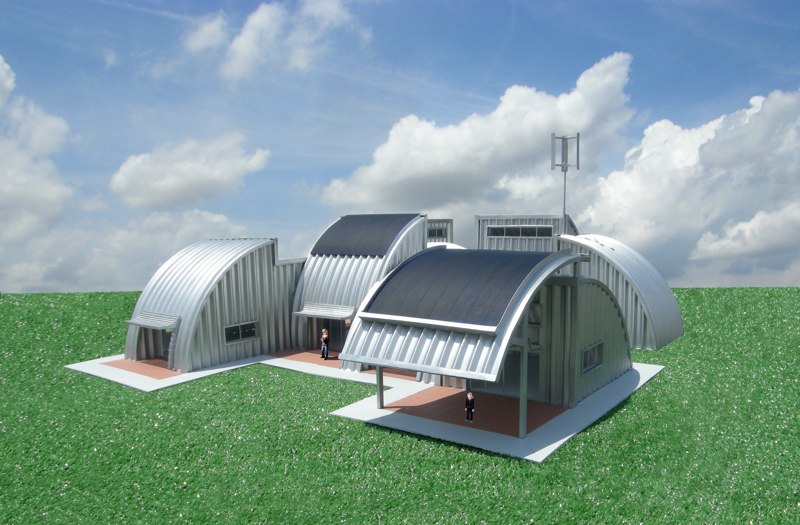
It consists of four ISO shipping containers – two 40 and two 20 ft. which I arranged in a zigzag pattern (sawtooth). The west and north walls would be insulated on the outside using a method that Kelly Hart pioneered in his home. He used the polyurethane feed and seed bags which he filled with porous lava rock: scoria (which has a R. value close to 3 per inch) and made an “earth bag” wall with the material (other materials such as perlite could be used as insulation material instead of scoria). He then applied a paper-crate plaster to the outside of the wall – which is a plaster made with waste paper products (newspapers magazines etc.) with a bit of Portland cement and sand for a binding agent.
Having the north and west walls heavily insulated will shield the home from the north winds of winter and the hot summer afternoon sun of summer. The south and east walls would be insulated on the inside of the home – a two by six wooden frame would be built and would be filled with a soy base foam insulation (which has an R value of around 7 per inch). The wall would be finished with larch wood panels – an ecologically sustainable forest product which has a warm appearance that would contrast well with the steel walls of the container.
The majority of window space would be located on the south and east walls which would help warm the home in winter using a passive solar method; the winter sun hangs low in the sky in winter and will shine directly into the home. In the summer the three foot roof overhang will block out the direct sunlight into the home helping to keep the home cool.
Having windows on the east walls would also catch the morning sunlight to help warm the house when it is at its’ coolest. Having good shade on the east wall windows would help to keep out the morning summer sun in mid summer. A good floor idea for this home would be a radiant heat tile flooring – the thermal mast of the floor would hold the heat energy very efficiently, like a thermal battery. Another good idea to put more thermal mass into the home would be to have adobe brick walls on the north and to the west inside the containers – this would greatly reduce the energy needed for heating and cooling the house.
Another though I had on this design is to separate the three main rooms into three tiny, separate living units – a triplex layout. Having 3 tenants would make such a home more affordable to the individual tenant. The occupants could invest the savings into energy saving geothermal equipment and pvc. solar panels.
To me, the best thing about Google sketch-up is that it allow you to visually realize any idea you can have about the designing of just about any product. Years ago when I had a home idea the only way I could share it would be to write a short novel on the idea and work with an engineer to make a drawing. Sketch-up certainly simplifies the process and if you can put a bit of time into your drawings the possibilities are quite limitless.
It’s a great opportunity to share these ideas and I love to hear any feedback on this concept home – maybe you have an idea that would make this idea better.


VERY cool Craig!! Looks like the roof structure was a bit tricky to work out. I can envision a framing contractor having fun building that. This is a really innovative design using shipping containers. Kudos!
I would argue, though, that 1000 sf IS small. But, that’s great thing, not a detractor. I think small house folks are in the mindset of thinking anything over 500sf is big. For most families 1000sf would be quite tight.
Also, I’m probably missing it, but I’m not seeing a place for “mechanicals” (water heater, furnace, etc.). Or is it in the space directly opposite the front entrance?
Very inspiring design!
I noticed that Craig referenced the fact that I had used earthbags filled with scoria to build a house, which is true, but the bags were misprinted polypropylene rice bags and the plaster is called papercrete, just for the sake of acuracy. You can see photos and a description of this house at http://www.greenhomebuilding.com/earthbag.htm#ourhouse
Thanks Kelly!
Hello all
I am happy to see the replies to this design concept. I’ve been under the weather lately so I apologize for taking so long getting back to you.
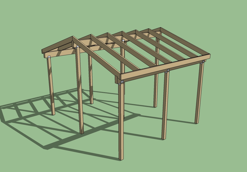
I would agree with you Anne – framing this roof would be a big challenge. Building three conjoined, traditional saltbox style roofs would be much easier to build and I would be happy with such house but for this concept I was thinking of a design that would visually bring the house together as an artistic whole. I also wanted an overhang on the south-west end of the house to give a visual cue to where the main entrance is. I am planning to bring these drawings to the engineers at work to see if we can come up with a steel truss system that could be cut and punched on the C.N.C. machines. I have worked building sets for film and theater years ago – I like working with wood, it’s a more “forgiving” material than steel to work with but I am more comfortable working with the preciseness of steel.
I do have a small mech. / broom closet room on the north west end of the house – I don’t have a close up of it but if you look really closely you can see the “tank-less” water heater and the breaker box. What you can’t see is the washer drier in the main washroom .
I can see that 1000 sq. ft. would be small for a family – not everyone is going to fit there lives into a 200 sq. ft. house – what I like about tiny houses is the idea of doing with less – it’s the idea of “if you are living in a 2000 sq.ft. home could you make changes to your life to live in a 1000sq.ft? Would you be happier in a smaller home and less debt?
Thank you Kelly for posting the link to your site like Tiny House Design, it is a great wealth of alternative home building ideas – it is the source of my idea of insulating the shipping container from the outside and I hope other people can use this idea with other design concepts.
Craig
Just wondering where you get the “R. value close to 3 per inch” for scoria. I am interested in using scoria for underfloor insulation for a rammed earth floor, and need an authoritative R-value for scoria in order to convince local building regulators it would achieve satisfactory insulation.
Greg
Oh, this is a great design. My favorite so far, in fact. Best little detail? The Bernese Mountain Dog!
Yes, it’s got to be large enough to have the dogs, or why live there? We loved our Berners so much. Our lives won’t be complete until we have them again. We had three. They would follow the kids everywhere…
I think the container homes have an amazing amount of potential. Like wooden puzzle toys; such an attractive assortment of shapes! I love how you worked this one out. It’s wonderful.
Especially with room for the dogs.:)
This is great, and perfect for rural Oz. I love the layout. I am assuming 6 containers in total? The roof looks odd, however. As the containers are waterproof on top, we would use this sort of floor plan and do a large skillion ‘fly over’ of the whole construction. Airflow between tops of containers and roof, huge water catchment, good $en$e and useful storage for surfboards up top in safety.
Good to see a clash poster on the wall 🙂