The Free Agent House by Jibe Design
Juliet, the principal architect at Jibe Design, shared this clever container-based home design with me and thought it might be interesting to readers of Tiny House Design. I think she’s absolutely right and applaud her for this new take on shipping container based homes.
The main design challenge was to squeeze a small off-grid home into a 15-foot wide city lot. Shipping containers are 8-feet wide, so immediately you might see how some creative solutions would be needed. After all if you placed two containers side-by-side they would extend one foot beyond this tiny space.
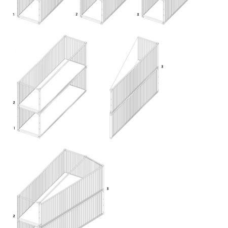
So she teamed up with Naquib Hossain, a frequent collaborator, and produced this novel solution. Stack two shipping containers and cut a third diagonally to open the interior space up while maximizing the available lot size. This approach resulted in an interior that measures 628 square feet on two levels, made from three 30-foot shipping containers.
While this diagonal cut and stacking would add to the fabrication effort, it should definitely help the home feel a lot less like a narrow metal box. The total expected cost to build this home is $50,000.

Here’s what Juliet says about the project:
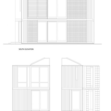
The Free Agent House explores the urban possibilities of living efficiently and affordably “off the grid.” The home is constructed of three shipping containers sliced and stacked to fit on a fifteen foot wide city lot. The efficient layout maximizes passive heating and cooling. Glazing on the southern frontage receives the winter sun and sliding louvers block the summer heat. Vacuum-insulated-panels super-insulate the building envelope’s tight perimeter and achieve an exceptional R-value with minimal thickness. A seasonal heat collector augments the passive heating system.
Low voltage appliances run off a rooftop photovoltaic array. The sun also heats the home’s water. The only municipal utilities the home connects to are the water and sewar systems. A stormwater collection cistern irrigates the extensive vegetable garden. At an estimated price of $50k, the building houses a free agent, liberated from high construction and operating costs.
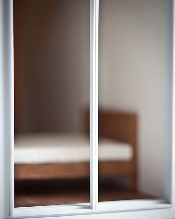
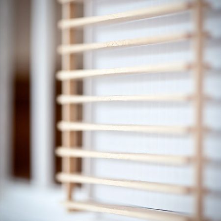
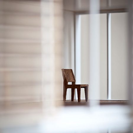
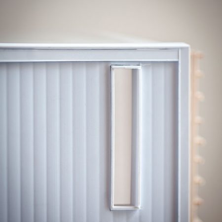
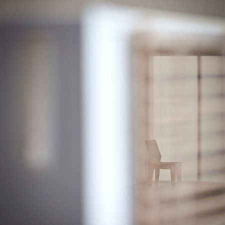
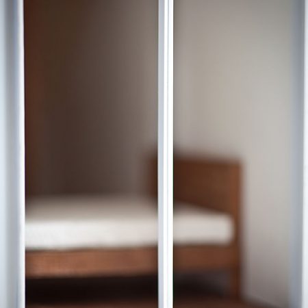
Jibe Design built a physical model of their design, a rarity now that computer renderings have become the norm. Stuart Goldenberg of Goldenberg Photography shot pictures of the house model as an art project. Stuart’s photographs expand the project. The photographs express a certain melancholy and sense of silence.
When asked “Is that cost estimate achievable?”, she answered, “The cost has been rigorously analyzed. The key to the low cost is the client himself – a skilled craftsman in many trades – who will build much of the project with his own hands.”
To learn more visit Jibe Design. Photo credit to Goldenberg Photography.

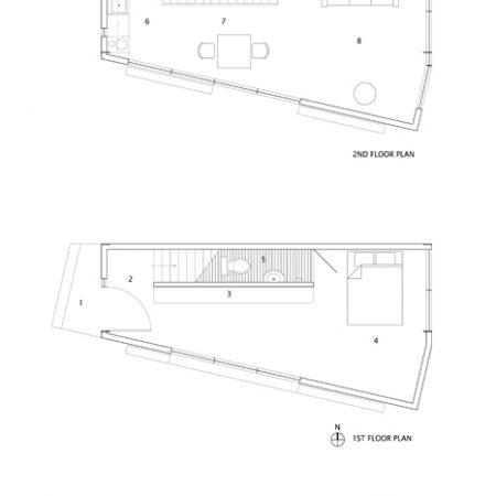
With that square footage they should be able to do better than one cramped bath, no laundry and just one bedroom.
I agree with you, just a lot of wasted space!
I like it. Spare and peaceful and clean. And you could stick a laundry under the staircase if you wanted to.
Ground floor entrance right to the bed? No thanks. And why must anything ‘innovative’ include other than right angles?
Brian – In this case innovation is about using the extremely limited medium of shipping containers to build an interesting residence on a site too narrow to accomodate 2 of them side-by side. The groundfloor bedroom can be screened easily, and probably should be in the representations. The concern about laundry is likewise solveable, though perhaps not without ruining some of the other moves.
The photos appear to be of a model (I see basswood in #4). While the blur does make these images feel more ‘real’, I actually want to see how the building goes together, and would prefer clear images.
I’m not sold on the identical upstairs/downstairs footprint, as varying that is one of the few moves you can make to create difference, but it does make detailing the exerior easier and cheaper.
This is really clever in its simplicity. It’s easy to forget that it’s all shipping containers. The diagonal split they used manages to add the extra space to the living room and bedroom where it’s most appreciated. I like it.
Awesome! What a great concept!
“made from three standard 30-foot shipping containers” really? Did you mean 20 or 40? They don’t come in 30’s, far as I know.
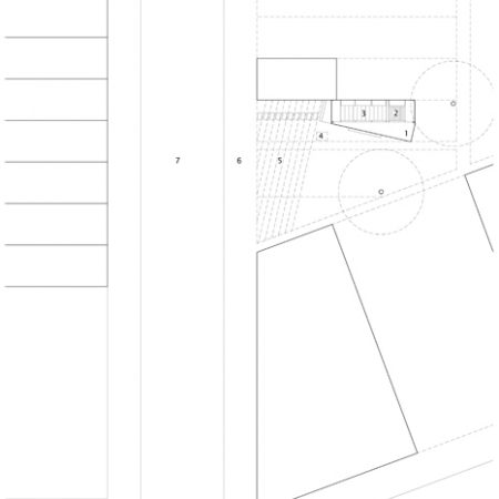
The idea has merit but I agree the interior seems sparse. The pictures though… they do nothing to help you understand the layout further then the little floor plan provided. Too many pictures for art’s sake rather then understanding design.
20′ and 40′ containers are most common, but shipping containers also come 10′, 45′,48′, and 53′ long. I agree that it is hard to get a sense of the space of the building from the photos. But the plans are clear and the photos are lovely in their own right.
I meant to add that containers do come 30′ long…
I think living in a space with other than square angles has a comforting effect over the long run – a little more like nature. And I love the spare design which, of course, would be settled into differently by each occupant. I like to think I would keep the floor space free for Tai Chi.
Such an imaginative solution!
I think it’s remarkable how they created such a sense of spaciousness within relatively small confines. The tiny houses I’ve seen until now are even tinier and make use of every square inch, which has its own appeal. This design provides something quite different; it’s another set of choices.
It seems like stacking two identical shapes might make for the greatest stability, short of taking on added engineering challenges. That in addition to the advantages already mentioned.
It’s very inviting for the right individual!
One problem I see with the design. The diagonal cut will not be the same length as the long side of the container, it will be longer … basic geometry.