Tiny House with Moving Walls – part 2
In the first round of playing with the idea of moving walls I based the design on a 16′ by 16′ footprint. Since I like challenges I decided to go smaller this time but keep the same requirements of being livable for a happy couple with the occasional visit of another couple for dinner. This tiny house design concept is 144 square feet, a room 12′ by 12′. Like the first round, the roof and walls construction could be anything.
(side note: I changed the scale from the last drawing to make it easier for me to draw, so if you compare the drawing in part 1 you’ll notice the difference. Both are to scale, just different scales.)
Overall Concept
The bathroom is smaller. Its now 3′ by 7′. The shower would be a full 3×3 shower stall with a shower curtain; the sink would be a small pedestal or wall hung unit; and the toilet would be a small composting toilet with a remote collection tank. I took the dimensions of this little toilet from an Envirolet composting toilet. You could use another small footprint toilet too if composting toilets are not your thing.
Only one wall/cabinet moves in this design but I’m making use of two sets of murphy bed hardware to get as much function out of the smaller space. One would be used for a queen size bed and the other would be used for a small sofa on the opposite wall. One of my blog visitors, Carey, sent me some ideas and a link to a cool murphy bed manufacturer and it gave me some ideas. Thanks Carey!
On the other side of the cabinet from the queen murphy bed would be a fold-out 36″ by 60″ table. The folding chairs would fit into the cabinet in the upper left corner of the drawing. You’ll notice a hinged panel hiding an empty space and the chair cabinet. This faux panel helps keep the moving wall from looking too big. If a cabinet like this covers a wall completely, from ceiling to floor and wall to wall an illusion is created that the cabinet is more like a wall. If you break holes in the faux wall surface and show it’s depth the cabinet will begin to look like an enormous obstacle in the room destroying the illusion.
Living Room Mode
When the moving wall is closed the room is kitchen-less and would serve as a living room or bedroom. The sofa can be flipped out in kitchen mode or living room mode. If the table and sofa are folded out at the same time getting onto the sofa or chairs around the table may be a bit hard to do.
Kitchen Mode
Open the wall to reveal the kitchen. Flip down the table and set-up the chairs and you’re ready to eat. Just be sure to pull the chairs out of their cabinet before you open the wall.
Bedroom Mode
Finish your evening snack, do the dishes, get your glass of water and then close up the kitchen. Then flip up the sofa and flip down the queen bed. The bathroom is accessible in any mode of course… ‘nature calls mode’ waits for no one to flip-up or flip-out. LOL
Part Three Preview
For the third act I’m going to go bigger, yep leaving ‘tiny house’ behind and venturing into ‘small house’. I think I’ll draw one big room with a bathroom off to the side or in a corner and have multiple moving walls that form several bedrooms. I’ll shoot for a flexible design that will allow from one to three bedrooms, a larger kitchen, and a washer and dryer.

I’ve really enjoyed reading the blog and seeing your design ideas. But, in that bathroom arrangement, there is nowhere to stand when you’re opening the bathroom door from the inside! Switch the door direction, perhaps?
Great Observation. Perhaps a sliding door, that slides into the wall and out.
Very interesting design
where are the inhabitants going to put:
clothes
shoes
towels
food (or do they eat out/go to grocery store everyday?)
cleaning supplies (vacuum/bucket/mop/soap)
garbage
pots, pans etc
I would suggest making a pile or two of all the things you use in a week or month (or even better a year) and then figuring out how to fit them into a tiny house.
I have lived in small/tiny houses and have used rented storage or other space for off season/seldom used items.
Thanks EJ. I actually started some detailed drawings of the cabinets but never posted them. Maybe I should do that. There is actually a lot of vertical space and some of them are double sided.
Excellent suggestion on figuring out the pile of stuff needed. It reminded me of the 100 things challenge. http://www.guynameddave.com/100-thing-challenge.html
Jason… excellent point. Looks like a pocket door is the only way to go with such a tiny bathroom. 🙂
Love the 100 things! I would love to do that, but living in the country I would have to make too many exclusions for tools….
Maybe for personal items without books?
Yeah 100 things seems a bit hard to do… but I love the frame of mind it puts me in… downsize downsize downsize… why do we have/need all this junk anyway right?
I love the square design. It makes the most out of the space and improves heating efficiency. I would build an outhouse and recapture the space. Instead of storing folding chairs, hang them on the wall on nice pegs, like the Shakers used to do. You could hang and strap them to the bottom of the murphy bed, that way they disappear when you fold down the bed!
I would make the square 14×14. The extra two feet makes a huge difference, and still stays under 200 sq ft.
I posted on the part 1 entry before I realized there was a part 2. Sorry.
For the bathroom you can put the sink in the corner, and use one faucet to control the sink and the shower. Doing that will let you cut the size of the bathroom down substantially. 3′ x 4′ could probably work. You just need a container to keep the paper dry.
At 144 sf this tiny house would be smaller than my popup camper, although it only has 84 sf of floor (with two king beds cantilevered off the ends). There’s plenty of space for just me on a weekend trip. For two of us for a week it still works. It’s a little more challenging for us, perhaps, due to musical instruments. With 4 people we’re in each other’s way and stuff is piled up.
People who spend a lot of time in campers have figured out how to reduce things to a minimum, although 100 things seems a bit too hard for me. I see he counts pens, and I’m sure I’ve got 100 of them 😉 Anyway, you might find it useful to meet some people at campgrounds and see how they organize their interiors. I can’t live without a coffee maker and my wife needs a tea kettle on the stove and a crock pot.
It is amazing though how much more efficient built in furniture and storage is. I made built-ins for our home-office and they work really well.
Here’s an idea you may wish to consider:
On one wall you could have a built in bench. The bench can be padded and lift up for storage (a quilt for winter perhaps). The table could drop down even with the front edge of the bench. With this arrangement you have provided seating for the table and seating for the room in one unit. Since it’s in the corner, you can wrap the back around the corner and it’s a comfy place to read a book. You can place a shallow cabinet or some shelves above the bench, or a window.
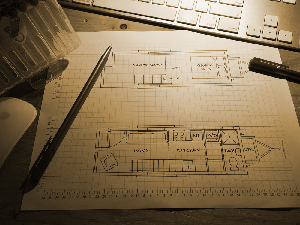
I like the sleeping loft concept. With a 6/12 roof pitch a 12′ room only has 6′ of headroom at the peak, less the depth of the loft joists, but if you build the house with 10′ studs and put the loft at 8′ you can get enough headroom to stand. For me, a tiny house would have to have a porch with a roof over it. Using the shotgun style you could extend the loft over the porch, creating much more usable space without appearing to.
I know that you have looked at a few different pullout beds previously, but the idea that’s on this site might work out to less work and/or cost.
http://tinyhouseblog.com/stick-built/katys-don-vardo-for-sale/
I think that going more futon style with a folding foam matress rather than the pillows depicted may be a good option.
You know, the more I think about it, the more I like the idea of this one on your site:
http://tinyhouseblog.com/tiny-furnishings/slide-away-bed/
The changes to it that I would make though are that it be long enough to lay on comfortably in the “couch” position so that when it’s slid out it takes up less space towards the room, AND along the “top bar” space, I’d have built in shelves to create morre storage space…
You may also find this site interesting for bed solutions:
http://www.zoom-room.com/galleryNYCondo.asp
and BTW…I do LOVE the whole idea of the movable walls…I wonder if any small apartment people in big cities would love the idea as well…you could probably sell the idea to a small space ideas magazine!! 🙂
Sorry…I can’t help myself..lol! I found your site after initially looking at Gypsy Vardos, which THEN led to Tumbleweed Tiny houses site, which then led to you! One of the options for saving space in the vardo was a bed that was on pulleys, which (naturally) was pulled up during the day and let down at night(for pictures go here: http://www.enslin.com/rae/gypsy/wagon13.htm ,for the pulley diagram, go here: http://www.enslin.com/rae/gypsy/bed.html ).
While looking at the Tumbleweed houses I thought a murphy bed for the main floor was a good solution for added sleeping space, and in looking for that I came accross this: http://www.doublespacebeds.com/index.html , it wouldn’t work so much for a trailer in my opinion (I think there HAS to be alot of weight to it), but for one of your fantastic small houses it might be good…