Usonian Inspired Home by Joseph Sandy
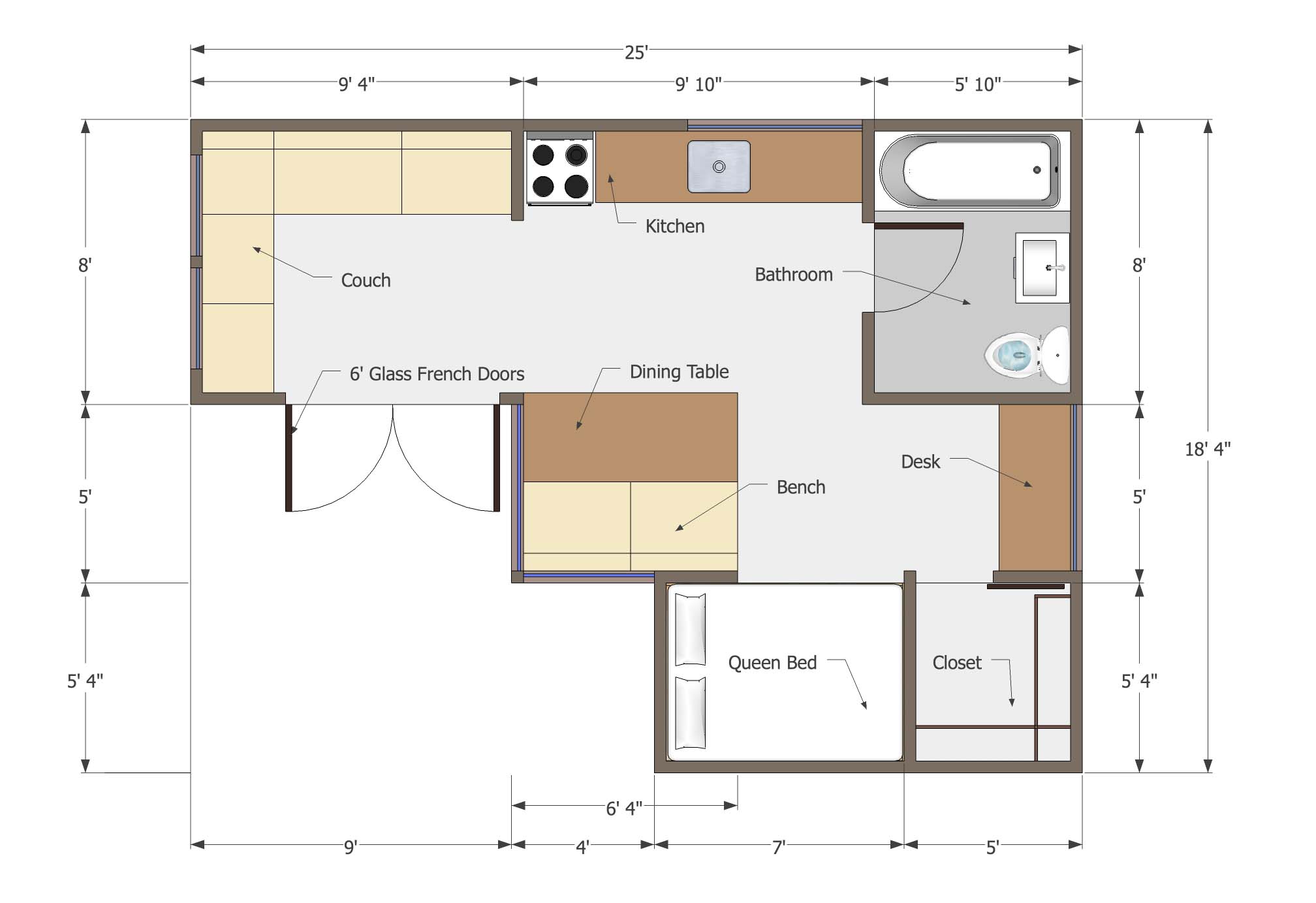
Usonian homes were originally the invention of Frank Lloyd Wright with the first example, The Jacobs House, which was completed in 1937. He imagined these as small low-cost single-family homes that were designed unlike many of the common homes of the day. Like most of Wright’s work Usonian homes inspired much of what is considered modern architecture today.
Usonian homes featured flat roofs, open living areas, small bedrooms, limited storage space, a passive solar design, and were often “L” shaped to provide a central exterior courtyard. While there were few Usonian homes built by Wright they have inspired architects and designers interested in frugality for decades. Joseph Sandy just posted this small 350 square-foot home on his blog which was inspired by the Usonian concept. Here is a sample of Joseph’s design.
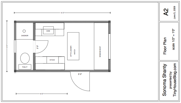
While Joseph’s design is much smaller than Wright’s Usonian homes it’s captures many similar features and values. As you can see the interior space is optimized for living with the sleeping, storage, and systems areas tucked out of the way. Most of the furniture is also built-in to maximize the space. I’m looking forward to seeing more illustrations of this house on Joseph’s blog in the future. He has a real talent for simple home design and I suspect this new design will contain more great ideas.


Fabulous! What a perfect, compact use of space. Yet there’s room for everything, including a dedicated workspace, that doesn’t need to be tidied away.
I’ve always had a soft spot for sleeping nooks.
This was my version of a usonian house that fits my needs for a big office space and an easier bed to make and change, and lots of storage / utlity area.
well, i guess it won’t let me upload a file
WOW!
The only thing I see missing is a way to heat it, but replace the stove with an old woodburner and you’re set.
Nice plan, will be interesting to see roof lines.
If your going to heat with wood you need an indoor wood box and a summer cook stove (could maybe be outside).
I would put at least a small window in the sleeping nook.
And my usual question – where do you hang wet coats and winter jackets?
But perhaps this is a southern California design in which case no need for winter considerations.
This is great starting point, however let’s take it to a two bedroom, allow for a wood stove,a usable kitchen design and windows in the sleeping areas and for cross ventilation
On further thought: I’d put a window in the sleeping nook and maybe a small built in storage nook at the head of the bed for alarm clock, tissues, book, etc. And maybe a drawer under the bed nook for additional storage.
And where would the utilities go? Water heater, etc.
Hate to say it, but I don’t like this much.
Everybody who is interested in housing designs should read ‘A Pattern Language’. It’s an amazing book that explains much of why this design specifically doesn’t work well, and why houses in general work on both a physical and psychological level (among other levels).
A house this small is going to be for at most two people, so there is no need to hide the bed away. And this bed is next impossible to “make”.
This design makes poor use of space too. it would feel very small for it’s sq. footage. Especially if you actually invite as many people over as there is available seating. I live in a smallish place and found that I had to get rid of much of my seating (kitchen chairs and the Lazy Boy) so I would have more usable floor space.
Personally, I have always thought that bathrooms and kitchens belong in an altogether different building (think Michael’s dogtrot designs here). A small house will get very humid with a bathroom installed and will likely have fungal problems. Also, kitchens and baths attract bugs. Roaches need moisture, ants are looking for that spilled sugar, etc.
My two….
Great comment Downs. Here’s a link to the book he suggested which should be the first book any serious designer (in any field) should own or at least read.
http://bit.ly/3VnECd
I do think that some of the common patterns can be adapted and downsized though… but as Downs indirectly points out… when molds are broken care should be taken with the potential fall-out like moisture in the house, spills, etc.
A few changes to make this workable/livable. move the desk to the bed headboard wall, add a window, put the bed where the closet is and reconfigure the closet to open toward the new bedroom, and pull out the bedroom wall to make it wide enough for two people to access from either side (and make the bed). These changes would allow for a second bedroom nook to be added and would drastically improve the sightlines through the house.
The procession is still a bit awkward and SOME kind of entryway is needed unles that is being done through a courtyard outside the front door.
I like the concept though, and could see it used as an efficiency or ADU near a property line.
needs to move the bath door to the wall by the desk. Better privacy from the Kitchen /couch area and better access from the bedroom area
Exactly !
And no major revisons required to do so. 🙂
I agree with Downs as well overall. I think with the addition of more footage it is a very interesting floor plan. Windows are greatly needed to help with ventilation. the double wide doors are needed to get furniture in. However the width of the living room needs to be widened to the seating area. The dining table can be replaced with a banquet the is oriented horizontally. A wall can be placed where the single chair is located to enlarge the bedroom space.
The desk in the bedroom can be placed where the headboard for the bed is. and the closet can be placed alongside to the bathroom wall. I think that adding four feet overall will greatly improve the livable space in this plan. The only confusing thing that I immediately notice is that there is no REFRIDGERATOR!
I like the overall concept that needs more width and depth to work better.
Bobbi
This is a great plan. Some modifications could be made, but is functional as is. If I were a young person without roots I would consider this as a first house until married. However it could also serve an older person or couple. I think the exterior could use a little work to improve the proportions without changing the major dimensions any at all. This is a good design. I think it would make a fantastic house for a weekend getaway deep in the forest.