Who’s Next Entry – Version 2

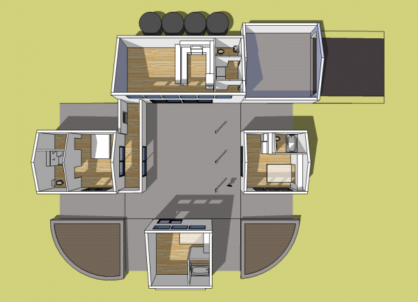
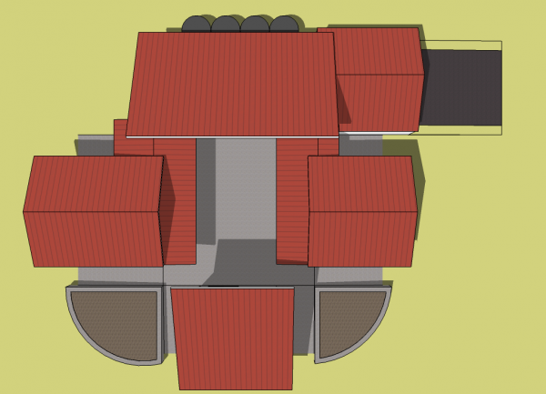
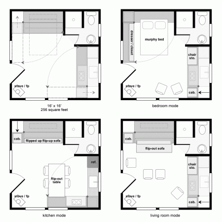
Below is the updated design for my Who’s Next Competition entry. At first you’ll probably think it’s an entirely different house but when you compare the floor plan to the first version you’ll quickly realize they are pretty much the same… just in a slightly different arrangement.
All the changes were made as a result of reader feedback in comments and directly though email. The main themes I heard were:
- Improve accessibility.
- Add an optional method to move from space to space in winter.
- Add an optional garage.
- Reduce the total square footage.
- The modular approach is not as efficient as a simple house of the same square footage.
- Open up the covered patio.
For the next round I’m going to refocus my attention on specific features, make them the priority, and bring more cohesiveness to this tiny house cluster. But I do like what’s happening with the courtyard and can see making that the focal point and possibly adding a covered walkway all the way around.
So take a look at this awkard phase 2 and let me know what you think. Thanks Again!
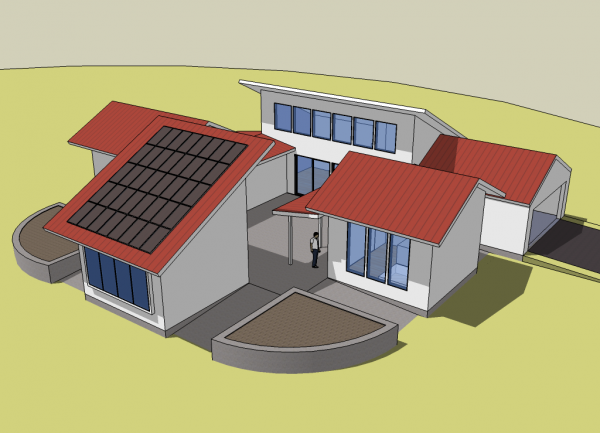
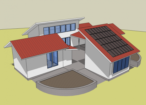
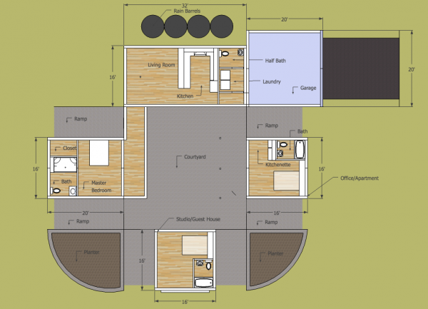
Below: There would be a door connecting the main unit to the enclosed walkway. There would not be an interior french or sliding door into the bedroom. I left it in by accident.


Both versions are excellent. Just a couple of suggestions to consider:
Both designs are very symmetrical. You could consider shifting some of the units slightly to give the houses a more spontaneous feel in keeping with their casual nature. For example, in version 1 you could shift the art studio a bit to the left (opening up the entrance), and shift the office a bit to the right. In version 2, adjusting the positions of some units might allow for a more compact plan so it doesn’t require such a huge lot.
For version 2, I think I’d place the entrance to the master bedroom as close to the living room as possible, then turn the remaining stretch of hallway into a covered patio off the bedroom.
Also in version 2, the studio seems out of proportion. You might make it narrower and longer, so it is proportioned more like a smaller version of the main living unit. The lower roofline will also let more light into the courtyard and living room windows.
All in all, these are very intriguing designs.
Some nice changes in v2 Michael. A lot of my concerns were covered ( sorry, I didn’t get a chance to comment).
I had concerns about the roof running into each other like that ( water flowing from a roof into a wall is a design best avoided as it is difficult to do correctly – I know, I just sold a house that had that) – but that’s gone in this version. Also, I thought there should be a garage ( where to keep the tools, after all!)
One practical issue I still see with this design is that the PV panels are placed on the guest house but you’ve removed the utility room (I think ) and the panels couldn’t be farther away from the garage – so the question is – where is the necessary equipment for the solar power located?
Also, perhaps those rain collection tanks should now be placed next to the garage and now you can put a window in the kitchen.
As well, I would be a little concerned about having plumbing and hot water having to be distributed to 4 different buildings seemingly as far away as possible from each other ( think of the drainage and plumbing design and expense)
I had a similar design in my previous house and they ended up having to put separate hot water tanks in each section of the house. Or are you thinking to have solar hot water and perhaps a gray water system?
Where is the main entrance?
Is one closet enough storage space?
Do all 4 buildings need plumbing?
What an awesome design — I fell in love with tiny houses, but they won’t really work for our family right now (two kids, three adults, and a golden retriever… a pit bull… 13 chickens….)
However I can definitely see something like this working out. In fact I can see it being really good for families with older kids; While everyone still lives in a smaller space, each kid has what could *almost* be “their own house”. Or adults, for that matter (in a roommate situation like ours)
Thank you so much — loving the concept more every day!
I like the revision. My agree with Frank with a bit of a revision. If I were spending time in that house with a spouse/partner, I would like to have a separate space (other than the great room) to read, have my own quiet space. Since there is a courtyard, it seems a shame to just pass along it on the way to the master br. While Frank suggests an open patio, what about an open area that could be used for such purpose. I know there is a studio but early a.m., evening would be a nice place to have a space near the master.
Michael, I feel that the flexibility of the multi pod layout is fine in theory but in practice I wonder how it would work in a high snow/rain fall area especially with an open courtyard connecting pods that are relatively close together.
The forces on the various pods from snow loading/drifting caused by noisy air flow around the pods could be difficult without closing the courtyard area in and looking at the roof heights overall.
The power of the wind to create destructive forces on the edges of each of the roofs and potentially noise issues even at low wind speeds are also a concern.
The runoff from storm water are going to require serious engineering of the roof/ground area to prevent serious problems even with water tank storage.
I am not a big fan of closed walkways probably cos they remind me of school corridors!
Hope this helps!
Mark
I like this version better. I agree you could use more storage but that could be in the form of furniture or built in bookshelves/cabinets.
I think the north or west wall of the great room could use a couple windows so you have some multidirectional lighting. Maybe a door from the garage on the south side that opens onto the walk way?
I agree more covered walkway could be good or atleast sufficient overhangs to keep the snow off where people would be walking.
It is looking good!
I agree with Frank. Shifting the rooms would help significantly. The outdoor space between the rooms feel like a bunch of hallways. Bring the master closer to the living room. Have the guest rooms close also and then you could combine their two baths into one. Then the leftover now larger outdoor ‘halls’ would be more like rooms.
What if one of the guest rooms was at an angle? Or if the shape was not square but round or Octagonal. What if the guest room was two stories? While it would not be nice for the owners it could be sold to them in that it is for the grandkids, and it would add some great dynamic that the house needs.
Why does the entire house need to be tinyhouse units? How about a larger more traditional house and the guest house and office are the traditional tinyhouses. A large one and a small one. Contrast them from the big house, but have them tie in in the style.
Does the garage have to be a full garage? Why not just a carport and a lockable storage area? My older inlaws use their garage like a covered porch. The covered porch of the first design was good, just not in the center of the house. Sliding the units around would open it up to the world. The second design needs a larger covered outdoor space.
I wonder if the couple you are designing the house for would have an interest in this for one of the guest bedrooms?
http://cgi.ebay.com/Mosely-Folding-Bath-Tub-NEAR-PERFECT-UNIQUE-RARE_W0QQitemZ170448378496QQcmdZViewItemQQptZAntiques_Furniture?hash=item27af83da80#ht_500wt_1182