Vodafone Mobile Solar Home
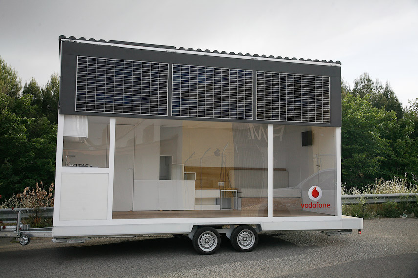
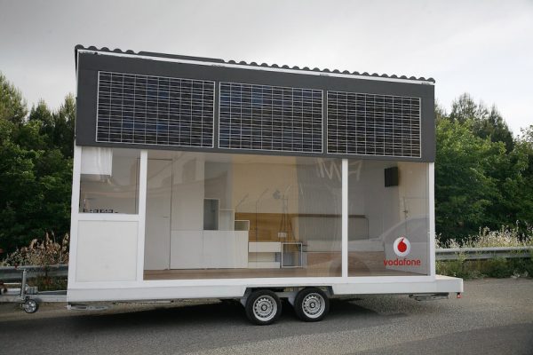
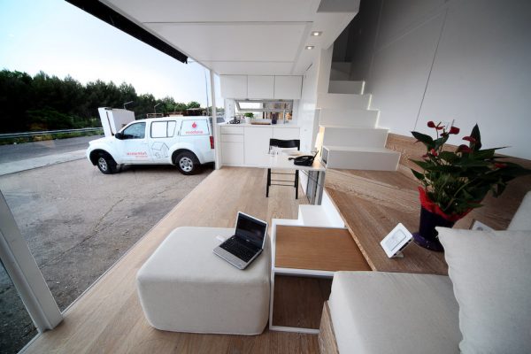
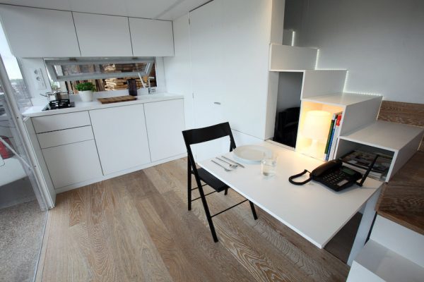
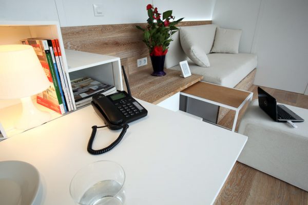
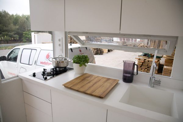
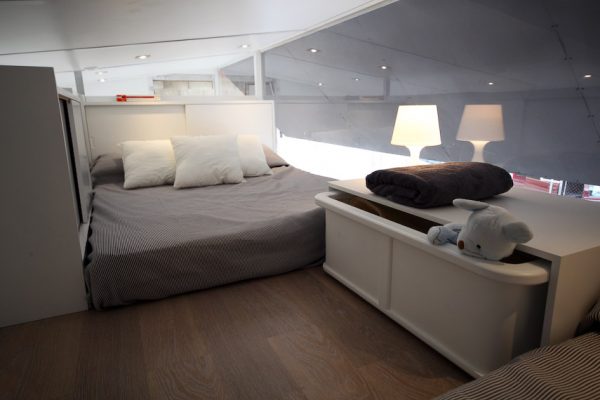
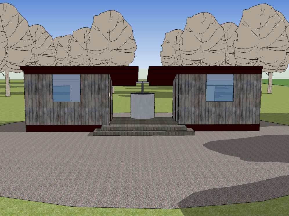
Built as a showcase for Vodafone’s fixed phone and wireless internet services this tiny house is a wonderful example of how to create a lot of functionality in a tiny living space. The walls are white polyethylene panels and the most stunning design feature is the clear polycarbonate window wall. The house measures 19.7-feet long, 8.2-feet wide, and 12.6-feet tall and it has a staircase, bathroom, kitchen, bedroom loft, and living room. It’s amazing how much they packed into this tiny house.
I especially like the clean interior and ample storage space to keep the clutter out of sight. The bathroom under the staircase is a clever trick and something I’ve not seen before in a mobile tiny house. I’m guessing that the giant window had more to do with the house’s role as a technology showcase but it is a very cool feature; although on a hot day I’m sure cool is the last thing you’d be thinking it was.
Watch the video on Tiny House TV



Great, simple, lean, shiny. The only thing I am thinking about is the isolation (and heating) for living in middle and northern Europe (like in the Netherlands and Germany). I want a mobile, tiny house like this!
I agree… this might make a better display case than practical home but it is really well done. With a few modifications, and smaller windows, it could be very usable.
This one is really cool Michael, I enjoyed the video last night and was hoping you would do a post on it to…Kent
I gotta agree with everyone else. I think it’s amazing that they actually got a full stair case and a reasonable height in the second level. Are you sure this guy is only 12 and a half feet tall?
Very nice modern look, and the double use of a full stair case + book shelf is very nice.
I wonder if that shade swings out for a proper awning, and is that made from solar flexible arrays? Again, very nice idea.
That’s really cool. Are there any photos of the inside of the bathroom?
I wonder if the height they mention is the hight of the structure minus the trailer. It looks like it to me.
There are more photos on the project website. Scroll to the bottom of this page: http://lacasamovil.com/la-casa
This interior design style reminds me alot of the Solo Mini Home:
http://www.sustain.ca/2009/02/26/8×36-solo/
After going to his blog and using babblefish.com on it and seeing some other links, I think this is designed more to be a RV to show off the wireless connection to the internet than a Tiny house for just living. But, it is perfect for what I want except for the roof. I did double check the height that they stated, 12.6 ft is about 3.5m. But, I am not sure if it includes the trailer, They may have higher road standards for “lorries.”
There is one photo of the WC w or as we call it bathroom.
One more thing, I did not see anything showing the floor plans. But, I would be cool to see them printed up.
It’s a really cool concept. The interior reminds me a bit of the Deseo Lifestyle RV:
http://www.lifestyle-caravan.de/en/lifestyle-caravan/gallery-impressions.421.html
Oh my, its a bit too much open plan……
This is really attractive. I’d like to see more of this type of tiny home.
The exterior is a little weird looking, but it’s absolutely beautiful on the inside.
I guess if it were mine I would tint the windows or something. But even though they look funny because they’re so big, it must make it feel very roomy from the inside. 🙂
i think its a very expensive little house but worth it.. its modern and very high class design… nice…
but.. is there a possibility to buy this mobile home??? where??
I love it! I am in awe of the mid century modern “feel” and clean design. It’s the ultimate in use of such a small space. I want one now!
Impractical for the elderly…
Seems like every design tries to fit old ideas into a tiny space. We need to develop new habits:
-Rather than a table, use your lap.
-Rather than a separate bedroom, try a daybed or futon couch.
-Rather than vertical storage, store items under a daybed or couch.
-Rather than a towel rack, try a simple hook.